目次
概要
【SpringSecurity】#3~ 独自のログイン画面でシンプルな独自のログイン画面を実装しました。
これに、Bootstrapでデザインを施していきます。
Bootstrapのサンプルを基に実装しますので、以下も参照しておいて頂くと良いと思います。
(参考)【Bootstrap】シンプルなサインインフォーム
準備
Mavenのpom.xmlにBootstrapを追加します。
執筆時点(2021/2/20)でBootstrap5はbeta版であるため、
Bootstrap4系の最新版である4.6を使用することとします。
MavenRepositoryから設定情報を取得します。
Bootstrap » 4.6.0
pom.xmlに追記します。
|
1 2 3 4 5 6 7 8 |
<dependencies> ... <dependency> <groupId>org.webjars</groupId> <artifactId>bootstrap</artifactId> <version>4.6.0</version> </dependency> </dependencies> |
実装
ソースコード
ログイン画面(login.html)
|
1 2 3 4 5 6 7 8 9 10 11 12 13 14 15 16 17 18 19 20 21 22 23 24 25 26 27 28 29 |
<!DOCTYPE html> <html xmlns="http://www.w3.org/1999/xhtml" xmlns:th="https://www.thymeleaf.org" xmlns:sec="https://www.thymeleaf.org/thymeleaf-extras-springsecurity3"> <head> <link rel="stylesheet" href="https://stackpath.bootstrapcdn.com/bootstrap/4.3.1/css/bootstrap.min.css"> <title>書籍情報管理システム | ログイン</title> </head> <body class="text-center"> <div class="alert alert-danger" role="alert" th:if="${param.error}"> ユーザIDとパスワードが一致しません。 </div> <div class="alert alert-primary" role="alert" th:if="${param.logout}"> ログアウトしました。 </div> <h1 class="h3 mt-2 mb-3 font-weight-normal">ログイン</h1> <form class="w-25 mx-auto" th:action="@{/login}" method="post"> <label for="username" class="sr-only"></label> <input class="form-control" id="username" type="text" name="username" placeholder="ユーザID" required autofocus/> <label for="password" class="sr-only"></label> <input class="form-control" id="password" type="password" name="password" placeholder="パスワード" required/> <input class="btn btn-outline-primary my-1" type="submit" value="Sign In"/> </form> <p class="mt-2 mb-3 text-muted">© 2021</p> </body> </html> |
画像
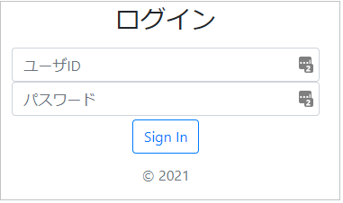
ログイン画面
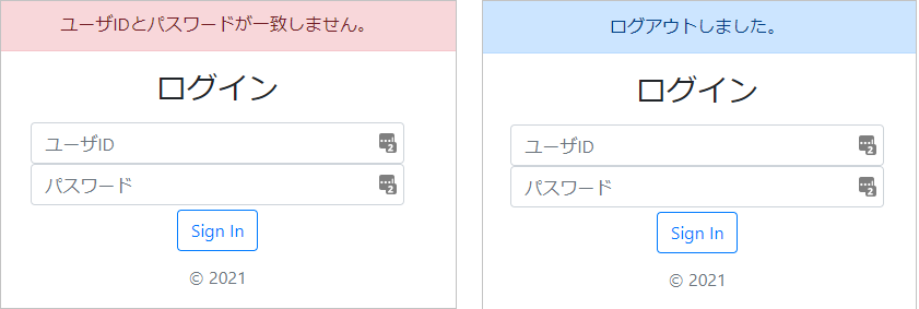
ログインエラー時/ログアウト時のメッセージ
個別解説
-
- Bootstrapのリンク設定
linkタグをheadタグ内に追記します。
|
1 |
<link rel="stylesheet" href="https://stackpath.bootstrapcdn.com/bootstrap/4.3.1/css/bootstrap.min.css"> |
-
- 中央寄せ
bodyタグを中央寄せに設定します。
|
1 |
<body class="text-center"> |
-
- メッセージ
ログイン失敗時とログアウト時のメッセ―ジを表示するデザインを設定します。
ログイン失敗時:alert-danger
ログアウト時 :alert-primary
|
1 2 3 4 5 6 |
<div class="alert alert-danger" role="alert" th:if="${param.error}"> ユーザIDとパスワードが一致しません。 </div> <div class="alert alert-primary" role="alert" th:if="${param.logout}"> ログアウトしました。 </div> |
アラートのデザインは以下を参考にして下さい。
Alerts – Examples
-
- 必須入力、自動フォーカス
required:未入力の場合、必須入力を促します。
autofocus:画面表示時、指定した入力フォームにカーソルが入った状態になります。
|
1 2 3 |
<input class="form-control" id="username" type="text" name="username" placeholder="ユーザID" required autofocus/> |
-
- ボタン
ボタンをデザインします。
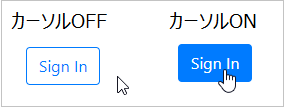
btn-outline-primaryのデザインを使用するとカーソルのON/OFFでボタンの色に変化があるので、ユーザが直感的にわかり易いデザインになっています。
|
1 |
<input class="btn btn-outline-primary my-1" type="submit" value="Sign In"/> |
(カーソルOFF/ONの違い)
まとめ
- pom.xmlにBootstrapの構成を追加するし、linkタグを入れることで利用可能になる。
- Bootstrapはclassを指定するだけで簡単にデザインを埋め込めるCSSライブラリである。
- 公式サイトにExamplesが用意されており、大抵のデザインは真似するだけで実装可能である。
おすすめ書籍
辞書的にも引けるので手元においておくにはおすすめの1冊です。
リンク


コメント